Temperature Change History
Is the global climate changing? Is the world getting warmer?
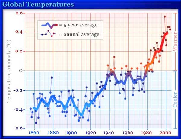
Yes. But let’s look more closely at what that means. We can start with the time from 1856 to the present. We have a good record of global temperature for this recent period. Accurate temperature measurements were made at many locations around the world.
There have been some sharp year-to-year fluctuations. During some periods, such as the 1940s, there was a drop in global temperature, but the overall trend is up when we look at the past century and a half.
What if we examine a longer period of time—say, the past 1,000 years? This presents a problem since accurate records of temperature were not kept prior to the middle of the 19th century. But there are ways of estimating temperature from other information such as the size of growth rings on trees and the composition of ice taken from Antarctica and Greenland. The records used for these indirect measurements of temperature are called "proxy data." Find out more about how temperature estimates are made from proxy data.
|
Graph based on data from the Climatic Research Unit of the University of East Anglia. |
The average global temperature has risen in the past 150 years. The period from 1961 to 1990 is the comparison point for this graph. This is represented by the horizontal line at 0. The anomaly, or variation from this average, is shown for each year.
The average global temperature for a given year is indicated by a blue or red dot. For example, the year 1900 was 0.2 C degree (0.36 F degree) cooler than the 1961–1990 average. The warmest year in this record was 1998, nearly 0.6 C degree (1.1 F degrees) warmer than the 1961–1990 average.
The heavy blue and red line traces the average global temperature for five year periods. For example, the average temperature for 1998—2002, which is centered on 2000, was 0.4 C degree (0.7 F degrees) above the 1961–1990 average. The period from 1958 to 1962, centered on 1960, was right on that average.
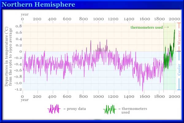
The next graph shows the average temperature of the Northern Hemisphere over the last two millennia.
The portion to the right of the vertical line corresponds to the time period covered by the first graph—about 150 years. In the context of the past 2,000 years the late-20th-century increase in temperature is quite sharp. What about the rest of this time span? The period of several hundred years up to the 19th century has been referred to as the Little Ice Age in Europe. The exact dates are not agreed upon. There is much evidence of a cooler climate than exists today or in the warm period from about 900 to 1100. Glaciers advanced. The Baltic Sea and the River Thames in London frequently froze during winter. Growing seasons were shortened. During especially severe winters livestock died in large numbers. The climate was also cooler in the northeastern part of North America. However, it is not clear if the cooling was global or limited to the North Atlantic region.
|
Graph based on data reported by Moberg, et.al., in Nature, V. 433, 10 February 2005. |
The purple portion of the line is based on indirect measurements, or "proxy data." The green portion represents actual thermometer readings.
In the centuries before the Little Ice Age, Norse explorers had ventured as far as North America and established colonies in Iceland and Greenland. With the onset of a colder climate, sea travel was impeded by the increase in sea ice. Contact between Scandinavia and these colonies was limited. Voyages to Greenland eventually stopped. Lacking supplies from Europe and faced with shorter growing seasons, the Greenland settlements disappeared by the early 1400s.
Is Climate Change Normal?
It looks like the climate is continually changing. Are we in a brief warm period now? Will the trend reverse? What’s the long-term picture?
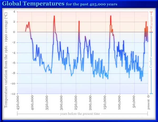
Here’s a graph of estimated global temperature for the past 425,000 years. This temperature record was computed from analysis of ice cores taken at Vostok, a Russian research base in Antarctica, starting in 1970. The deepest core reached 3,623 m (11,886 ft) into the ice sheet. The ice at the bottom has been undisturbed for about half a million years. During this time there have been four ice ages.
|
Image based on data from the National Oceanographic and Atmospheric Administration. |
Global temperature variation for the past 425,000 years. The present is at the right. The horizontal 0 line represents the 1961–1990 average global temperature. The numbers on the left show the variation from that baseline in °C.
The data were derived from an analysis of ice cores taken at the Vostok station in Antarctica. Find out more about how temperature estimates are made from proxy data.
The present day is at the far right of the chart. What do we see? First of all, there’s quite a bit of fluctuation. There are long periods of time when the average global temperature was as much as 9 C degrees (16 F degrees) colder than now. These were ice ages. Much of the northern part of the world was covered with thick sheets of ice, much like we see today in Greenland and Antarctica. The most recent ice age ended about 12,000 years ago. There were also times when it was warmer than today. On the whole, we are in a relatively warm period. What causes these changes in climate? There are many factors. Find out more…
This content has been re-published with permission from SEED. Copyright © 2026 Schlumberger Excellence in Education Development (SEED), Inc.


